How Public Health Agencies Can Simplify Compliance Without Slowing Down Care
See how public health agencies can simplify compliance, reduce report errors, protect sensitive data & give staff more time for client care with...
Learn how Executive Directors can use nonprofit dashboards, KPIs, board reports, funder reporting, and human services data to make better decisions without hiring a data analyst.
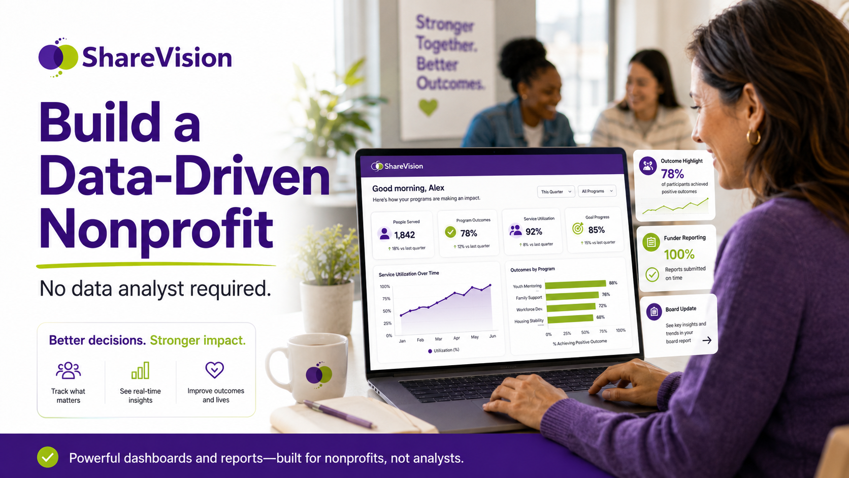
Every Executive Director wants better visibility.
You want to know which programs are growing.
You want to know where staff are stretched.
You want to know whether services are being delivered on time.
You want to know whether clients are making progress.
You want to know which funder reports are coming due.
You want to know where compliance risks are building.
You want to know whether your organization is fulfilling its mission effectively.
But in many nonprofits and human services organizations, the data needed to answer those questions is scattered across spreadsheets, paper files, emails, program databases, shared drives, finance systems, and staff-created trackers.
By the time information reaches the executive level, it is often late, incomplete, manually cleaned, or summarized so heavily that the important details are missing.
This is why many leaders begin looking for better nonprofit dashboards, stronger nonprofit reporting, and clearer executive nonprofit reports.
The challenge is that most nonprofits do not have a dedicated data analyst. Smaller and mid-sized organizations may not have a business intelligence team, a reporting specialist, or an internal database administrator. Executive Directors and CEOs still need reliable data, but they often have to get it through program managers who are already busy, spreadsheets that are difficult to maintain, or reports that take days or weeks to prepare.
The good news is that becoming data-driven does not always require hiring a data analyst.
For many human services organizations, the first step is not advanced analytics. It is building a practical reporting foundation with the right nonprofit KPIs, role-based dashboards, standardized workflows, and software that turns daily documentation into useful management information.
A data-driven nonprofit is not an organization that measures everything.
It is an organization that measures the right things, reviews them consistently, and uses that information to make better decisions.
This guide explains how Executive Directors can build a more data-driven nonprofit without adding a data analyst role. It covers why executives struggle with data, which metrics actually matter, how nonprofit dashboards should be designed, what to include in funder and board reports, how to monitor service utilization and staff workload, how to track outcomes, real-world dashboard examples, how ShareVision dashboards support decision-making, and how to implement a practical reporting roadmap.
A data-driven nonprofit uses reliable information to guide decisions, improve programs, support accountability, and demonstrate impact.
This does not mean reducing human services work to numbers. It does not mean ignoring staff experience, client stories, professional judgment, or community context. It means combining those human insights with better information.
A data-driven nonprofit can answer important questions without needing to rebuild reports from scratch every time.
|
Leadership Question |
Data-Driven Answer |
|
How many clients are we serving? |
Current client counts by program, location, and status |
|
Are referrals increasing? |
Referral trends by source, program, and time period |
|
Are services being delivered as planned? |
Service utilization and completion rates |
|
Are staff workloads balanced? |
Caseloads, documentation volume, and overdue tasks by team |
|
Are clients making progress? |
Outcome achievement and goal progress dashboards |
|
Are we ready for funder reports? |
Required reporting metrics available in real time |
|
Are there compliance risks? |
Overdue forms, missing notes, incidents, and review deadlines |
|
Which programs need attention? |
Dashboards showing demand, capacity, outcomes, and risk |
A data-driven nonprofit has a clear source of truth.
Instead of depending on informal updates, manually compiled spreadsheets, or end-of-month reporting scrambles, leadership can see current information and use it to ask better questions.
The goal is not to remove judgment from leadership.
The goal is to give leadership better visibility so judgment is informed by reality.
Most Executive Directors do not struggle with data because they do not care about it. They struggle because the organization’s systems were not built to produce useful executive-level information.
Human services organizations often grow through programs, grants, contracts, and community needs. Each new program may introduce its own forms, funder requirements, spreadsheets, reporting formats, and workflows. Over time, data becomes fragmented.
|
Data Challenge |
What It Looks Like |
|
Information is stored in too many places |
Client records, spreadsheets, paper files, email, and shared drives all contain different pieces of information |
|
Reports are manually created |
Program managers spend hours copying, cleaning, and formatting data |
|
Metrics are inconsistent |
Different programs define “active client” or “completed service” differently |
|
Data is too late |
Leaders receive reports after decisions should have been made |
|
Reports are too detailed |
Executives receive long documents but not clear insights |
|
Reports are too shallow |
Leaders see totals but not trends, risks, or context |
|
Staff do not trust the numbers |
Data entry is inconsistent or duplicate records exist |
|
Dashboards do not exist |
Leadership depends on periodic updates instead of real-time visibility |
|
Systems are not connected to workflows |
Data is collected after the work instead of during the work |
The result is that executives may have plenty of reports but still lack confidence.
A board report may show how many people were served, but not whether outcomes improved. A funder report may show service volume, but not whether staff are overloaded. A program update may describe challenges, but not show whether those challenges are increasing across locations.
Executives do not need more data noise.
They need decision-ready data.
Hiring a data analyst can be valuable for larger nonprofits or organizations with complex evaluation needs. But many human services organizations are not ready for that step.
If the underlying systems are fragmented, a data analyst may spend most of their time cleaning spreadsheets, chasing program managers for updates, reconciling inconsistent definitions, and rebuilding reports manually.
That is not a data strategy. That is expensive spreadsheet cleanup.
Before hiring a data analyst, organizations should ask whether they have the basic reporting foundation in place.
|
Question |
Why It Matters |
|
Do we have a central source of client and service data? |
Analysts need reliable data to work with |
|
Are key fields standardized across programs? |
Inconsistent data creates unreliable reports |
|
Are staff documenting in structured workflows? |
Reporting depends on consistent input |
|
Are dashboards available for common metrics? |
Basic reporting should not require custom analysis |
|
Do we know which KPIs matter most? |
Analysts cannot fix unclear priorities |
|
Are reports connected to decisions? |
Data should serve leadership action |
|
Is data updated regularly? |
Outdated reports limit usefulness |
A data analyst can help interpret and improve data. But if the organization does not have clean, structured, accessible data, the analyst starts from a weak foundation.
For many nonprofits, the better first investment is a reporting system that captures the right information during daily work and makes it visible through dashboards.
Executive leaders often hear these terms used interchangeably, but they are different.
|
Term |
Meaning |
Example |
|
Data |
Raw information collected during work |
A service note date, referral source, client status, or goal progress rating |
|
Report |
Organized information for a specific purpose |
Monthly funder report or board program update |
|
Dashboard |
Visual or summarized view of current performance |
Active clients, overdue notes, service utilization, outcomes |
|
KPI |
A key performance indicator used to track progress |
Percentage of clients housed after 6 months |
Data is the raw material.
Reports organize data for communication.
Dashboards make data visible for monitoring.
KPIs focus attention on what matters most.
A strong nonprofit reporting system uses all four.
The mistake many organizations make is collecting data without defining KPIs, creating reports without dashboards, or building dashboards that are not connected to decisions.
Not every metric deserves executive attention.
An Executive Director does not need to monitor every form field, every task, or every case note. That level of detail belongs with frontline staff and supervisors. Executive dashboards should focus on mission, risk, capacity, performance, outcomes, and sustainability.
The best nonprofit KPIs help leaders answer one of five questions:
|
KPI Category |
What It Tells Leadership |
|
Reach |
How many people the organization is serving |
|
Demand |
How many people are seeking services |
|
Access |
How quickly clients enter services |
|
Utilization |
How much service is being delivered |
|
Capacity |
Whether staff and programs can meet demand |
|
Quality |
Whether services are completed consistently |
|
Outcomes |
Whether clients are making progress |
|
Compliance |
Whether required documentation is complete |
|
Risk |
Where safety, incident, or service concerns are emerging |
|
Sustainability |
Whether programs are financially and operationally viable |
The goal is to choose a small number of high-value metrics.
A dashboard with 50 metrics may look impressive, but it often creates confusion. A dashboard with 10 carefully chosen indicators can support better decisions.
Below are practical KPIs that many human services organizations can adapt.
|
KPI |
What It Measures |
Why It Matters |
|
Active clients by program |
Number of people currently receiving services |
Shows reach and workload |
|
New referrals |
Number of new people seeking services |
Shows demand |
|
Referral source |
Where referrals are coming from |
Supports outreach and partnership decisions |
|
Waitlist volume |
Number of people waiting for service |
Shows access pressure |
|
Time from referral to first contact |
Speed of response |
Measures accessibility |
|
Services delivered |
Number of visits, sessions, supports, or activities completed |
Shows utilization |
|
Service completion rate |
Planned services completed vs. scheduled |
Shows reliability |
|
Documentation completion rate |
Required notes or forms completed on time |
Supports compliance |
|
Outcome achievement rate |
Percentage of clients meeting goals or milestones |
Shows impact |
|
Incident rate |
Incidents by program, type, or severity |
Supports risk management |
|
Staff caseload |
Clients assigned per staff member |
Shows workload |
|
Overdue follow-ups |
Tasks or reviews past deadline |
Highlights operational risk |
|
Discharge reason |
Why clients exit programs |
Shows retention and service fit |
|
Funder report readiness |
Required reporting data complete and current |
Reduces reporting stress |
Not every organization needs all of these. The right set depends on services, funders, and strategic priorities.
Some metrics are easy to count but not very useful on their own.
|
Metric |
Why It Can Mislead |
Better Context |
|
Total clients served |
Does not show service intensity or outcomes |
Add program, duration, and outcome measures |
|
Number of staff activities |
Activity does not always mean impact |
Connect activities to goals or service plans |
|
Total referrals |
Does not show whether referrals were appropriate or accepted |
Track referral source, eligibility, and conversion |
|
Average caseload |
Can hide uneven distribution |
Show caseload by staff, complexity, and program |
|
Number of reports completed |
Does not show report quality or timeliness |
Track report accuracy and readiness |
|
Attendance totals |
Does not show engagement or progress |
Combine with completion and outcome data |
|
Incident totals |
Can be misleading without context |
Track by severity, type, location, and trend |
Executives should avoid vanity metrics.
A vanity metric looks positive but does not help leadership make decisions. For example, “we served 2,000 people” may sound impressive, but it does not explain whether the organization had capacity, whether clients improved, whether demand exceeded service availability, or whether outcomes were achieved.
Good metrics create better questions.
A nonprofit dashboard should not be a data dump.
It should be a decision tool.
The purpose of a dashboard is to help leaders quickly understand what is happening, what is changing, what needs attention, and where action may be required.
|
Principle |
What It Means |
|
Start with decisions |
Build dashboards around questions leaders need to answer |
|
Keep it focused |
Include the most important KPIs, not every available metric |
|
Show trends |
Compare current data to previous periods |
|
Use clear definitions |
Make sure everyone understands each metric |
|
Segment by program |
Organization-wide totals should be broken down when useful |
|
Highlight exceptions |
Show overdue items, risks, or unusual changes |
|
Refresh consistently |
Dashboards should be current enough to guide action |
|
Match the audience |
Executives, boards, funders, and supervisors need different views |
A dashboard should help an Executive Director move from “What is happening?” to “What should we do next?”
An executive dashboard should provide a high-level view of organizational health.
|
Dashboard Section |
Example Metrics |
Leadership Question |
|
Service reach |
Active clients, clients served this month, new referrals |
Are we reaching people? |
|
Demand and access |
Waitlist, referral volume, time to first contact |
Can people access services quickly enough? |
|
Service utilization |
Services delivered, completion rate, missed appointments |
Are services being delivered as planned? |
|
Staff capacity |
Caseloads, open positions, overdue documentation |
Are teams stretched? |
|
Outcomes |
Goal progress, outcome achievement, discharge status |
Are clients making progress? |
|
Compliance |
Required forms complete, overdue reviews, incident follow-up |
Are we meeting obligations? |
|
Risk |
Incident trends, high-risk clients, safety follow-ups |
Where do we need attention? |
|
Funder readiness |
Report deadlines, required data completion |
Are we ready for reporting? |
This dashboard should not require a data analyst to interpret. It should give executives clear visibility into mission delivery, capacity, and risk.
Boards need information that supports governance, strategy, risk oversight, and mission accountability.
Board members usually do not need operational detail. They need clear summaries that show whether the organization is healthy, effective, and aligned with strategy.
|
Board Reporting Area |
Suggested Metrics |
|
Mission reach |
Total clients served, program participation, demographics if relevant |
|
Strategic priorities |
Progress toward strategic plan goals |
|
Outcomes |
Program outcome achievement, client progress, impact indicators |
|
Growth and demand |
Referrals, waitlists, service expansion, unmet need |
|
Risk and compliance |
Incidents, documentation completion, audit readiness |
|
Staff capacity |
Vacancy trends, workload indicators, turnover context |
|
Financial alignment |
Service utilization tied to funding or program sustainability |
|
Key decisions needed |
Areas where board support or approval is required |
|
Section |
Purpose |
|
Executive summary |
Short overview of performance and key issues |
|
Mission impact |
Outcomes, reach, and client progress |
|
Program performance |
High-level trends by service area |
|
Risk and compliance |
Items requiring board awareness |
|
Strategic priorities |
Progress toward plan goals |
|
Decisions or discussion items |
What leadership needs from the board |
A strong board report should be clear enough for governance and detailed enough to build confidence.
It should not be a collection of disconnected program updates.
Funders usually want to understand whether funded activities were delivered and whether expected outcomes were achieved.
A funder reporting dashboard should track the specific metrics required by grants, contracts, or contribution agreements.
|
Funder Reporting Need |
Dashboard Metric |
|
Number of clients served |
Client count by program and reporting period |
|
Eligible population served |
Demographics or eligibility criteria |
|
Service volume |
Sessions, visits, hours, units, or activities delivered |
|
Program outputs |
Completed intakes, assessments, plans, workshops |
|
Outcomes |
Housing stability, employment, goal progress, wellness improvement |
|
Timeliness |
Time to service, completion deadlines, follow-up rates |
|
Reporting completeness |
Required fields completed |
|
Narrative support |
Key trends, barriers, and success indicators |
|
Metric |
Current Quarter |
Target |
Status |
|
Clients served |
185 |
175 |
On track |
|
New referrals |
72 |
60 |
Above target |
|
Service plans completed |
81% |
85% |
Needs attention |
|
Clients achieving one or more goals |
63% |
60% |
On track |
|
Follow-ups completed within 30 days |
74% |
80% |
Needs attention |
|
Required reporting fields complete |
91% |
95% |
Needs attention |
This type of dashboard helps leadership see reporting readiness before the deadline.
It also helps funder conversations become more transparent and proactive.
Service utilization is one of the most important reporting areas for human services organizations.
It helps leaders understand how much service is being delivered, where demand is highest, whether programs are operating near capacity, and whether funding is aligned with actual activity.
|
Metric |
What It Shows |
|
Number of services delivered |
Total activity volume |
|
Service units by program |
Where resources are being used |
|
Service hours by client |
Intensity of support |
|
Attendance rate |
Engagement and participation |
|
Missed appointment rate |
Access, engagement, or scheduling challenges |
|
Average service frequency |
How often clients receive support |
|
Service completion rate |
Whether planned services are delivered |
|
Utilization by location |
Site-level demand |
|
Utilization by staff role |
Workload and staffing patterns |
|
Utilization by funding stream |
Funding alignment |
|
Leadership Use |
Example Decision |
|
Staffing |
Add staff where service demand is increasing |
|
Funding |
Show funders how resources are being used |
|
Program design |
Adjust service models based on demand |
|
Capacity planning |
Identify programs nearing saturation |
|
Equity |
Identify groups with lower access or participation |
|
Sustainability |
Compare service activity to funding and staffing levels |
Executives should not only ask how many clients were served.
They should ask how much service those clients needed, whether the organization delivered it, and whether current resources can sustain that level of support.
Staff workload is one of the most important areas for Executive Directors to monitor, especially in human services organizations facing burnout, turnover, and recruitment challenges.
A staff workload dashboard should help leaders identify pressure points before they become crises.
|
Workload Metric |
Why It Matters |
|
Active caseload by staff member |
Shows distribution of client responsibility |
|
Case complexity |
Helps interpret caseload differences |
|
Service hours delivered |
Shows actual workload, not just assigned clients |
|
Documentation volume |
Shows administrative burden |
|
Overdue case notes |
Indicates workload or workflow issues |
|
Overdue reviews |
Signals compliance risk |
|
Open tasks |
Shows follow-up burden |
|
Incident follow-up assignments |
Shows risk-related workload |
|
Time to complete documentation |
Helps identify process friction |
|
Staff vacancy impact |
Shows workload pressure on remaining staff |
Caseload is useful, but it can be misleading.
Two staff members may each have 25 clients, but the workload may be completely different.
|
Staff Member |
Caseload |
Context |
|
Staff A |
25 clients |
Mostly stable clients, monthly check-ins |
|
Staff B |
25 clients |
High-risk clients, weekly visits, multiple incidents |
|
Staff C |
18 clients |
New clients requiring intensive intake and planning |
|
Staff D |
30 clients |
Group program participants with lower individual documentation |
A better workload dashboard combines caseload, service intensity, documentation requirements, risk factors, and overdue tasks.
This helps executives understand whether staffing issues are real or simply hidden by averages.
Outcome reporting helps leaders understand whether programs are creating meaningful change.
Outputs show what the organization did. Outcomes show what changed because of the work.
|
Output |
Outcome |
|
400 support sessions delivered |
72% of clients improved coping skills |
|
150 clients enrolled |
64% completed their service plan |
|
80 employment workshops delivered |
58% secured employment within 90 days |
|
1,200 residential support hours provided |
70% progressed toward daily living goals |
|
200 families served |
76% completed safety planning |
Executives need both output and outcome data.
Outputs help show activity and reach. Outcomes help show effectiveness and impact.
|
Outcome Area |
KPI |
Current Result |
Target |
|
Housing stability |
Clients housed after 6 months |
68% |
65% |
|
Employment |
Clients employed within 90 days |
57% |
55% |
|
Disability services |
Clients progressing toward personal goals |
74% |
70% |
|
Family services |
Families completing safety plans |
82% |
80% |
|
Senior services |
Clients reporting reduced isolation |
71% |
70% |
Outcome dashboards should include context.
If an outcome drops, executives need to know why. Was there a staffing shortage? A change in client complexity? A new referral source? A funding change? A data collection issue? A program model problem?
The number is the starting point for a better conversation.
Below are practical dashboard examples for different leadership needs.
|
KPI |
Current Month |
Previous Month |
Trend |
|
Active clients |
842 |
816 |
Increasing |
|
New referrals |
126 |
111 |
Increasing |
|
Waitlist |
94 |
78 |
Increasing |
|
Services delivered |
3,420 |
3,280 |
Increasing |
|
Documentation completion |
87% |
82% |
Improving |
|
Outcome achievement |
64% |
63% |
Stable |
|
Incident follow-ups overdue |
9 |
14 |
Improving |
|
Average caseload |
31 |
30 |
Slight increase |
This dashboard shows growing demand, improving documentation completion, and a rising waitlist. Leadership may need to examine capacity, referral sources, and whether service demand is increasing faster than staffing.
|
KPI |
Program A |
Program B |
Program C |
|
Active clients |
210 |
145 |
96 |
|
New referrals |
38 |
24 |
17 |
|
Average time to first contact |
3 days |
6 days |
2 days |
|
Service completion rate |
91% |
84% |
93% |
|
Overdue reviews |
12 |
19 |
4 |
|
Outcome achievement |
68% |
59% |
72% |
|
Documentation completion |
89% |
77% |
92% |
Program B may need attention. It has lower documentation completion, more overdue reviews, slower first contact, and lower outcome achievement. This does not automatically mean the program is underperforming. It may mean it is under-resourced, serving more complex clients, or using workflows that need improvement.
|
Staff Member |
Active Clients |
Service Hours |
Overdue Notes |
Overdue Tasks |
|
Staff A |
28 |
52 |
2 |
5 |
|
Staff B |
34 |
71 |
11 |
14 |
|
Staff C |
21 |
48 |
1 |
3 |
|
Staff D |
30 |
55 |
4 |
7 |
|
Staff E |
18 |
63 |
8 |
12 |
Staff B and Staff E may need support. Staff E has fewer clients but high service hours and overdue tasks, suggesting higher intensity. This type of dashboard helps leaders avoid making workload assumptions based on caseload alone.
|
Required Metric |
Completion Status |
Risk |
|
Client demographics complete |
96% |
Low |
|
Service units entered |
91% |
Moderate |
|
Outcome fields complete |
82% |
High |
|
Follow-up forms complete |
76% |
High |
|
Narrative report drafted |
Not started |
Moderate |
|
Financial reconciliation complete |
88% |
Moderate |
The organization is not ready for the funder report yet because outcome fields and follow-up forms are incomplete. Leadership can act before the reporting deadline instead of discovering the issue too late.
|
Strategic Priority |
KPI |
Current Result |
Target |
|
Expand access |
Clients served |
1,240 |
1,200 |
|
Improve responsiveness |
First contact within 5 days |
78% |
80% |
|
Strengthen outcomes |
Clients achieving goals |
66% |
65% |
|
Improve compliance |
Required documentation complete |
89% |
90% |
|
Support staff sustainability |
Average caseload |
29 |
28 |
|
Reduce waitlist pressure |
Waitlist volume |
106 |
85 |
The organization is meeting service reach and outcome goals but is experiencing waitlist and workload pressure. The board may need to discuss capacity, funding, staffing, or program expansion strategy.
Many executive reports fail because they are too long, too detailed, too late, or too disconnected from decisions.
A useful executive report should be clear, structured, and action-oriented.
|
Section |
Purpose |
|
Summary |
What leaders need to know immediately |
|
Key metrics |
The most important KPIs |
|
Trends |
What changed since the last report |
|
Risks |
What needs attention |
|
Wins |
What is working well |
|
Decisions needed |
What action leadership or the board should take |
|
Appendix |
Optional details for those who need more depth |
|
Reporting Problem |
Why It Weakens Decision-Making |
|
Too many metrics |
Leaders lose focus |
|
No comparison period |
Trends are unclear |
|
No targets |
Performance is hard to interpret |
|
No narrative |
Numbers lack context |
|
No ownership |
Follow-up is unclear |
|
No action items |
Reports do not lead to decisions |
|
Delayed data |
Information arrives too late |
The best executive reports combine dashboards with interpretation.
A dashboard shows what is happening. The executive report explains why it matters.
ShareVision helps human services organizations turn daily documentation into meaningful dashboards and reports.
Instead of relying on spreadsheets, manual exports, paper files, and disconnected tools, ShareVision gives organizations a centralized platform for client records, service documentation, workflows, outcomes, and reporting.
For Executive Directors and senior leaders, this means better visibility into program activity, staff workload, compliance, outcomes, and funder reporting readiness.
|
Executive Need |
How ShareVision Supports It |
|
Real-time program visibility |
Dashboards show current program activity and trends |
|
Better funder reporting |
Reports can pull from structured service and outcome data |
|
Board-ready impact data |
Leaders can summarize reach, outcomes, and strategic progress |
|
Staff workload insight |
Caseloads, tasks, and documentation can be monitored |
|
Service utilization reporting |
Services delivered can be tracked by program, location, staff, or client |
|
Compliance oversight |
Required forms, reviews, and follow-ups can be tracked |
|
Outcome reporting |
Client goals and progress can be connected to reports |
|
Reduced spreadsheet dependence |
Data is captured in workflows instead of manually compiled later |
ShareVision supports the foundation of a data-driven nonprofit: structured data captured during normal work.
An Executive Director can use ShareVision to monitor organization-wide performance.
|
Dashboard Area |
Example View |
|
Active clients |
By program, location, and status |
|
Referrals |
New referrals by source and program |
|
Waitlists |
Number waiting and average wait time |
|
Services delivered |
Total service activity by period |
|
Outcomes |
Goal progress and outcome achievement |
|
Documentation |
Completion rates and overdue items |
|
Incidents |
Trends by type and program |
|
Staff workload |
Caseloads and tasks by team |
This helps executives see where the organization is strong and where attention is needed.
Program Directors can use ShareVision dashboards to manage service delivery.
|
Program View |
Purpose |
|
Caseload list |
Understand active client volume |
|
Service activity |
Track delivered supports |
|
Overdue documentation |
Follow up with staff |
|
Goal progress |
Monitor client outcomes |
|
Review deadlines |
Stay ahead of compliance requirements |
|
Referral pipeline |
Manage demand and intake |
|
Discharge trends |
Understand program exits |
This gives program leaders visibility without requiring manual spreadsheet updates.
ShareVision can help leadership prepare board reports using current program data.
|
Board Metric |
ShareVision Reporting Source |
|
Clients served |
Client and program records |
|
Program activity |
Service documentation |
|
Outcomes achieved |
Goal and outcome tracking |
|
Waitlist trends |
Intake and referral workflows |
|
Compliance status |
Required forms and review tracking |
|
Incident trends |
Incident documentation workflows |
|
Strategic goals |
Configured dashboards and reports |
Instead of building board reports from scratch, leadership can use dashboards as the foundation.
ShareVision can support funder reporting by tracking the required data throughout the reporting period.
|
Funder Requirement |
ShareVision Support |
|
Client counts |
Program enrollment data |
|
Demographics |
Structured client profile fields |
|
Services delivered |
Service notes and activity records |
|
Outcomes |
Goal progress and outcome forms |
|
Follow-ups |
Workflow tasks and review records |
|
Documentation status |
Completion dashboards |
|
Narrative support |
Data trends for report writing |
This helps reduce the last-minute reporting scramble that many nonprofits experience.
|
Before ShareVision |
After ShareVision |
|
Reports are built manually in spreadsheets |
Reports are generated from structured system data |
|
Program managers send monthly updates by email |
Dashboards show current program activity |
|
Executives wait for reports to understand performance |
Leaders can review key metrics more frequently |
|
Board reports rely heavily on narrative |
Reports combine narrative, outputs, and outcomes |
|
Funder reports require manual data cleanup |
Required fields are tracked throughout the reporting period |
|
Staff workload is hard to see |
Caseloads, tasks, and documentation can be monitored |
|
Outcomes are tracked separately |
Outcomes are connected to client goals and services |
|
Compliance risks appear late |
Overdue items can be flagged earlier |
ShareVision does not replace leadership judgment. It gives leaders better information.
Building a data-driven nonprofit does not happen all at once.
A practical roadmap helps organizations move from scattered data to useful dashboards step by step.
Start with decisions, not metrics.
Ask leadership:
|
Decision Area |
Questions to Answer |
|
Program performance |
Which programs are meeting goals? |
|
Capacity |
Where is demand exceeding resources? |
|
Staffing |
Where are workloads becoming unsustainable? |
|
Funding |
Which reports are required and when? |
|
Compliance |
Where are documentation risks increasing? |
|
Outcomes |
Are clients making measurable progress? |
|
Strategy |
Are we advancing our strategic priorities? |
If a metric does not support a decision, it may not belong on an executive dashboard.
Start with 8 to 12 KPIs.
A practical first dashboard might include:
|
KPI |
Why It Belongs |
|
Active clients by program |
Shows reach and workload |
|
New referrals |
Shows demand |
|
Waitlist volume |
Shows access pressure |
|
Services delivered |
Shows utilization |
|
Documentation completion |
Shows compliance health |
|
Outcome achievement |
Shows impact |
|
Staff caseload |
Shows workload |
|
Overdue follow-ups |
Shows operational risk |
|
Incident trends |
Shows safety and risk |
|
Funder reporting readiness |
Shows reporting risk |
Keep it focused.
You can always expand later.
Data-driven leadership depends on shared definitions.
If one program defines “active client” differently from another, reports become unreliable.
|
Metric |
Definition Question |
|
Active client |
Is this based on enrollment, recent service, or open status? |
|
Referral |
Does every inquiry count, or only eligible referrals? |
|
Service delivered |
Does this include attempted contacts or only completed services? |
|
Outcome achieved |
Who determines achievement and when? |
|
Case note completed |
What counts as complete? |
|
Follow-up overdue |
What timeline applies? |
|
Discharge |
What categories should be used? |
Standard definitions make dashboards more trustworthy.
The best dashboards are powered by normal workflows.
Staff should not have to enter data separately just to feed executive reports.
|
Daily Workflow |
Dashboard Data Created |
|
Intake |
Referral volume, source, waitlist, access timelines |
|
Client profile |
Demographics, program enrollment, eligibility |
|
Service notes |
Services delivered, staff activity, utilization |
|
Goal reviews |
Outcome progress and achievement |
|
Tasks |
Follow-ups, overdue items, workload |
|
Incident forms |
Risk trends and follow-up status |
|
Discharge forms |
Completion rates and exit reasons |
When reporting data is captured during normal work, dashboards stay current and staff avoid duplicate entry.
Different audiences need different views.
|
Audience |
Dashboard Focus |
|
Executive Director or CEO |
Strategy, risk, outcomes, capacity, funding |
|
Program Director |
Program activity, caseloads, outcomes, documentation |
|
Supervisor |
Staff tasks, overdue notes, follow-ups, client risks |
|
Board |
Mission impact, strategic priorities, risk, sustainability |
|
Funder |
Outputs, outcomes, demographics, reporting requirements |
|
Frontline Staff |
Tasks, client goals, required documentation |
Role-based dashboards prevent executives from drowning in operational detail and prevent frontline staff from feeling monitored by irrelevant metrics.
Dashboards only matter if leaders use them.
Create a regular review rhythm.
|
Meeting |
Dashboard Use |
|
Weekly supervisor meeting |
Overdue documentation, follow-ups, caseloads |
|
Monthly program meeting |
Service utilization, referrals, outcomes, workload |
|
Executive leadership meeting |
Capacity, risk, strategic KPIs, funder readiness |
|
Quarterly board meeting |
Mission impact, strategy progress, risk trends |
|
Funder reporting cycle |
Required outputs, outcomes, and narrative data |
A data-driven nonprofit does not review data only when a report is due.
It uses data as part of regular leadership practice.
A dashboard should lead to decisions.
|
Dashboard Signal |
Possible Action |
|
Waitlist is rising |
Review capacity, staffing, eligibility, referral sources |
|
Documentation completion is dropping |
Simplify forms, retrain staff, adjust workload |
|
Outcomes are declining |
Review program model, client complexity, service consistency |
|
Staff workload is uneven |
Rebalance caseloads or adjust assignments |
|
Incident trends are increasing |
Review safety plans, staffing, training, or environment |
|
Funder data is incomplete |
Improve required fields and reporting workflows |
|
Service utilization is below target |
Review engagement, scheduling, or referral fit |
Dashboards are not valuable because they look professional.
They are valuable when they improve action.
|
Mistake |
Why It Causes Problems |
Better Approach |
|
Measuring too much |
Leaders lose focus |
Choose a focused KPI set |
|
Measuring only outputs |
Reports show activity but not impact |
Include outcomes |
|
Using inconsistent definitions |
Data cannot be trusted |
Standardize metrics |
|
Waiting for monthly reports |
Problems are discovered late |
Use dashboards regularly |
|
Ignoring staff workload |
Burnout risks stay hidden |
Track caseload and documentation burden |
|
Building board reports manually |
Reporting takes too much time |
Use dashboards as the foundation |
|
Tracking data nobody uses |
Staff lose trust in documentation |
Connect metrics to decisions |
|
Not reviewing trends |
Single-period data lacks context |
Compare over time |
|
Failing to explain data |
Numbers are misinterpreted |
Add narrative and context |
|
Treating dashboards as an IT project |
Adoption suffers |
Make it a leadership practice |
The most effective Executive Directors use dashboards to guide better conversations, not to replace them.
Nonprofit dashboards are visual or summarized reporting tools that help organizations monitor key metrics such as clients served, referrals, service utilization, outcomes, staff workload, documentation completion, funder reporting readiness, and program performance.
A nonprofit executive dashboard should include high-level KPIs related to mission reach, demand, access, service utilization, staff capacity, outcomes, compliance, risk, and funder reporting. It should focus on the metrics that help leaders make decisions.
Important nonprofit KPIs may include active clients, new referrals, waitlist volume, time to first contact, services delivered, documentation completion, outcome achievement, staff caseload, incident trends, overdue follow-ups, and funder reporting readiness.
Nonprofits can improve reporting by centralizing client and service data, standardizing KPIs, using structured workflows, building role-based dashboards, automating reports, and reviewing data regularly as part of leadership meetings.
Nonprofit reporting usually refers to prepared reports for funders, boards, executives, or compliance purposes. Nonprofit dashboards provide ongoing visibility into key metrics so leaders can monitor performance and act sooner.
Executive Directors should review key dashboards at least monthly, with some operational or risk metrics reviewed more frequently depending on the organization. Board-level dashboards are often reviewed quarterly.
Dashboards help with funder reporting by tracking required outputs, outcomes, demographics, service utilization, and documentation completeness throughout the reporting period. This reduces last-minute reporting work and improves accuracy.
Dashboards can support board reports, but they usually should not fully replace them. Boards still need narrative context, interpretation, strategic discussion, and recommendations from leadership.
Executive Directors do not need endless spreadsheets, complicated reporting systems, or a full data team to become more data-driven.
They need clear KPIs, reliable workflows, useful dashboards, and a consistent rhythm for reviewing information.
A data-driven nonprofit is not one that measures everything.
It is one that knows what matters.
It knows how many people it serves.
It knows where demand is growing.
It knows whether services are being delivered.
It knows where staff are stretched.
It knows whether clients are making progress.
It knows where compliance risks are building.
It knows what funders need.
It knows what the board needs to understand.
It knows when action is needed.
For human services organizations, better data is not about removing the human side of the work.
It is about giving leaders the visibility they need to protect the mission, support staff, strengthen programs, satisfy funders, and improve outcomes for the people they serve.
The right nonprofit dashboards can turn scattered information into clear insight.
And clear insight helps leaders make better decisions.
If your organization is still relying on spreadsheets, manual reports, disconnected systems, or delayed program updates, it may be time to build a stronger reporting foundation.
ShareVision helps human services organizations centralize client records, streamline documentation, track service utilization, monitor staff workload, report outcomes, and build dashboards that support executive decision-making.
Book a ShareVision demo to see how your organization can improve nonprofit reporting, build executive dashboards, and become more data-driven without adding unnecessary administrative burden.
See how public health agencies can simplify compliance, reduce report errors, protect sensitive data & give staff more time for client care with...
Learn how human services organizations can replace Excel, Google Sheets, and paper files with nonprofit workflow software that improves reporting,...
Explore how Public Health Tools by ShareVision empower nonprofits with data management, client tracking, and customizable reporting.